Signal Insights data details vary based on the category of the signal and ADARA updates Insights data every week. The following examples show the insights that correspond to travel categories.
See C6. Signal Definitions for more details on industry-specific solutions.
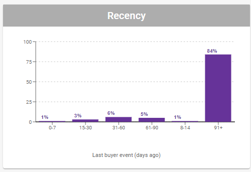
C3.1.1. Recency
This column chart shows the distribution of the number of days since the last buyer event. Hover your cursor over each column to view a detailed tooltip.
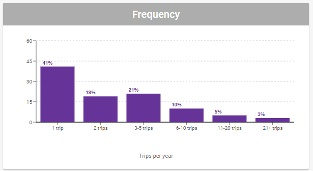
C3.1.2. Frequency
This column chart shows the distribution of the number of trips the traveler takers per year. Hover your cursor over each column to view a detailed tooltip.
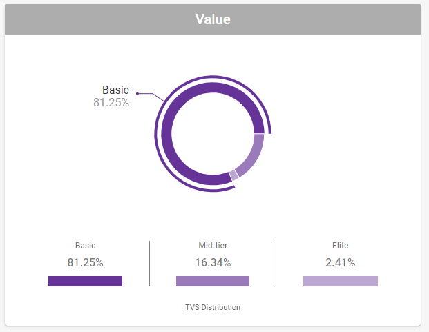
C3.1.3. Value
This donut chart is based on the most recent Traveler Value Score (TVS), and is updated weekly. It shows the proportions for the components that contribute to the whole TVS Score population: Basic (range: 0 to 299), Mid-Tier (range: 300 to 600), and Elite (range: 601 to 800). The legend shows the component groups of TVS with their percentage of the whole.
ADARA generates the TVS based on billions of search, booking, and loyalty data points from the world's largest travel companies. See https://adara.com/adara-traveler-value-score/ for more details on ADARA's TVS.
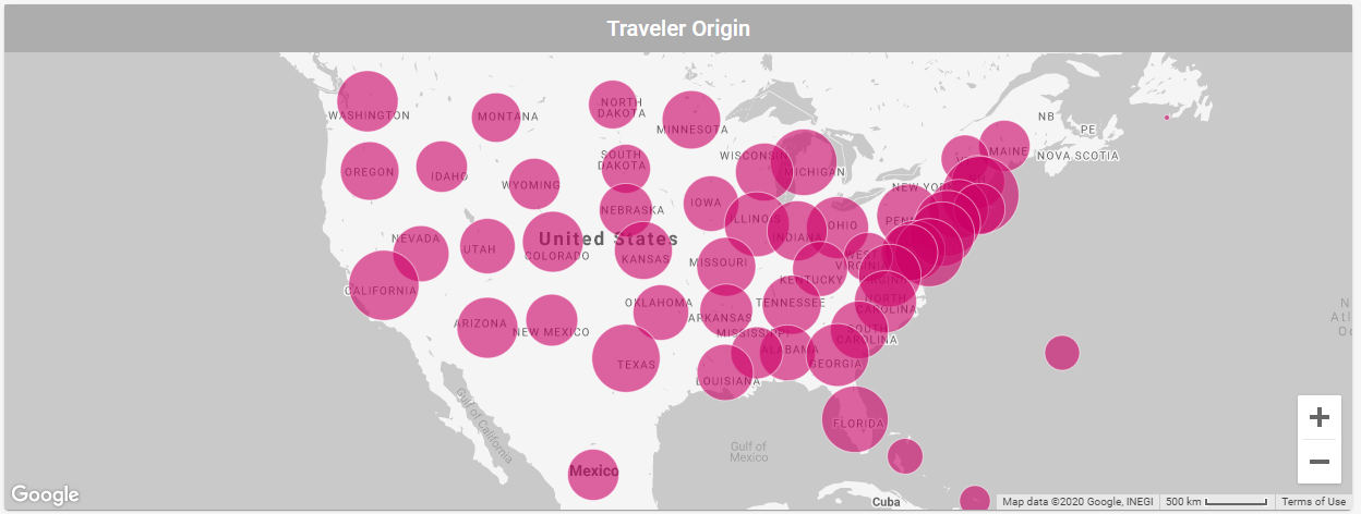
C3.1.4. Traveler Origin
The map view presents geographic data on a responsive, interactive map. The map circles are drawn based on location information, sorted by state for the USA and sorted by country for the rest of the world. These circles are sized based on the relative distribution of this location information. For flight travel events, ADARA uses the airport from which flight begins as the origin. For hotel travel events, ADARA uses the physical address of the hotel itself.
Hover over a circle to view a pop-up tooltip showing the name of the data group and the number of unique elements in that group. Hover away to dismiss this tooltip.
Select the + or - in the lower right corner of the map to zoom the map view larger or smaller. The default view is sized to display the continental United States and parts of Canada.
Click and drag anywhere on the map other than the above items to pan the map and data. The keyboard arrow keys pan the map, as well.
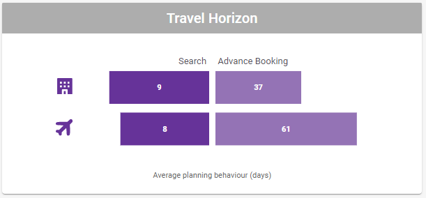
C3.1.5. Travel Horizon
This timeline chart shows the relationship between events and allows comparison of the time spans over which the events took place. This chart is based on the intervals between searching, booking, and travelling:
Search: the number of days between when individuals searched for travel and booked their travel
Advance Booking: the number of days between when individuals booked their travel and actually traveled
The timeline chart also shows separate rows for Hotel and Airline categories.
This chart only reflects timelines for the data for which ADARA has sufficient high-confidence data.
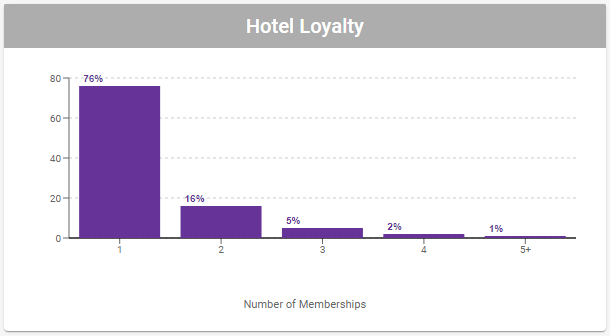
C3.1.6. Hotel Loyalty
This column chart shows the distribution of five tiers of Hotel Loyalty status: 1, 2, 3, 4, and 5+. ADARA derives our own Hotel Loyalty status tiers, mapping them and generalizing them across multiple hotel data partners that may have their own specific tiers. Hover your cursor over each column to view a detailed tooltip.
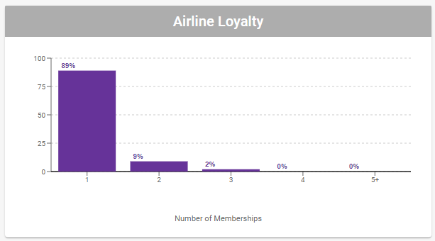
C3.1.7. Airline Loyalty
This column chart shows the distribution of five tiers of Airline Loyalty status: 1, 2, 3, 4, and 5+. ADARA derives our own Airline Loyalty status tiers, mapping them and generalizing them across multiple airline data partners that may have their own specific tiers. Hover your cursor over each column to view a detailed tooltip.
Select Back in the upper left to return to the previous C2. Signals Cards View Signals tab or Analyze tab.