Signal Insights data details vary based on the category of the signal and ADARA updates Insights data every week. The following examples show the insights that correspond to Finance, Retail, Experience, and Demographic signals.
See C6. Signal Definitions for more details on industry-specific solutions.
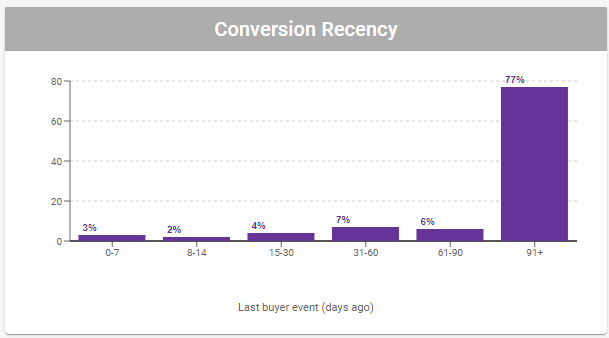
C3.2.1. Conversion Recency
This column chart shows the distribution of the number of days since the last buyer event. Hover your cursor over each column to view a detailed tooltip.
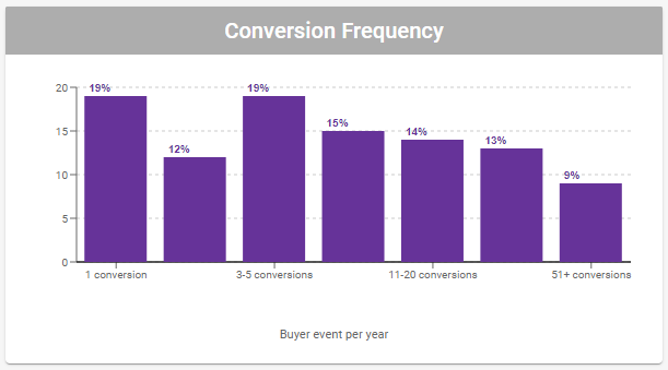
C3.2.2. Conversion Frequency
This column chart shows the distribution of the number of conversions the buyer makes per year. Hover your cursor over each column to view a detailed tooltip.
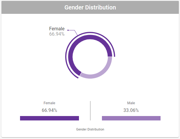
C3.2.3. Gender Distribution
This donut chart is based on the gender of the buyer, and is updated weekly. It shows the proportions for male and female components. Hover your cursor over each donut segment to view a detailed tooltip.
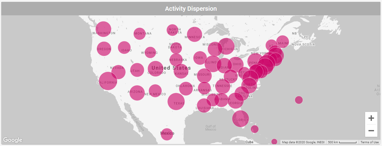
C3.2.4. Activity Dispersion
The map view presents geographic data on a responsive, interactive map. The map circles are drawn based on location information derived primarily from mapping IP addresses, then we sort these locations by state for the USA and by country for the rest of the world. We size these circles based on the relative distribution of this location information.
Hover over a circle to view a pop-up tooltip showing the name of the data group and the number of unique elements in that group. Hover away to dismiss this tooltip.
Select the + or - in the lower right corner of the map to zoom the map view larger or smaller. The default view is sized to display the continental United States and parts of Canada.
Click and drag anywhere on the map other than the above items to pan the map and data. The keyboard arrow keys pan the map, as well.
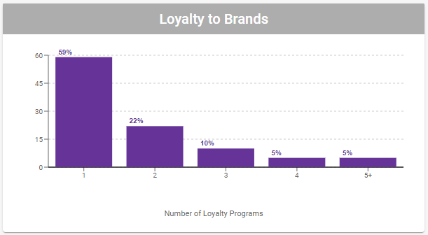
C3.2.5. Loyalty to Brands
This column chart shows the distribution of the number of loyalty memberships a buyer has. There are five tiers of Loyalty to Brands: 1, 2, 3, 4, and 5+ members. Hover your cursor over each column to view a detailed tooltip.
Select Back in the upper left to return to the previous C2. Signals Cards View Signals tab or Analyze tab.